This post contains affiliate links. If you purchase through my links, I may earn a small commission at no extra cost to you.
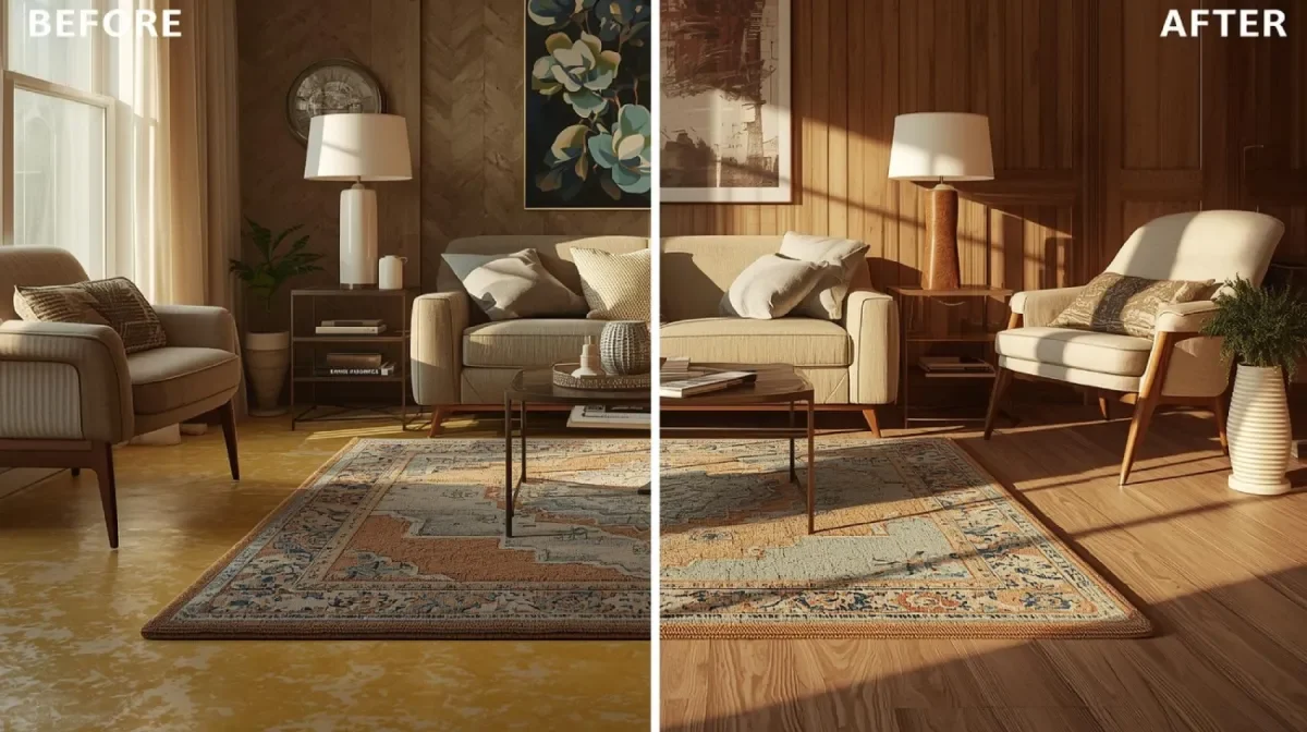
You picked the paint. It looked perfect on the sample. You rolled it on the wall and something went wrong. It’s reading pink in the morning and purple by evening and you have no idea what happened to the warm, cozy neutral you thought you were getting.
That’s the greige problem. Warm greige paint ideas sound simple in theory, but the wrong undertone turns a dream color into a renovation mistake. The right warm greige, though? It makes every room feel collected, calm, and done in the best way.
These 12 warm greige paint ideas work in every room of the house. Each one has been chosen for its ability to stay warm in changing light and play nicely with wood tones, white trim, and natural textiles.
1. Accessible Beige by Sherwin-Williams
Accessible Beige is the warm greige everyone ends up loving even if they didn’t pick it first. It has just enough beige to feel warm and just enough gray to feel current. In morning light it reads cream. In afternoon light it deepens to a true greige. It never surprises you in a bad way.
This is one of the best warm neutral wall colors for rooms with mixed lighting because it adjusts gracefully. It doesn’t fight with cool-toned art or warm wood tones. It just quietly makes the room feel finished.
Hot tip: Accessible Beige paired with Sherwin-Williams Antique White on trim is a combination that works in virtually every home style from modern farmhouse to transitional to coastal. It’s that flexible.
One thing to know: it can read slightly pink in rooms that get a lot of north-facing light. Always test before committing an entire room.
Rooms painted in Accessible Beige have a settled, permanent quality, like they were always supposed to look exactly like this.
Shop the Look
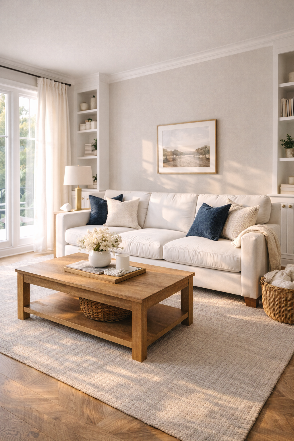
2. Agreeable Gray by Sherwin-Williams
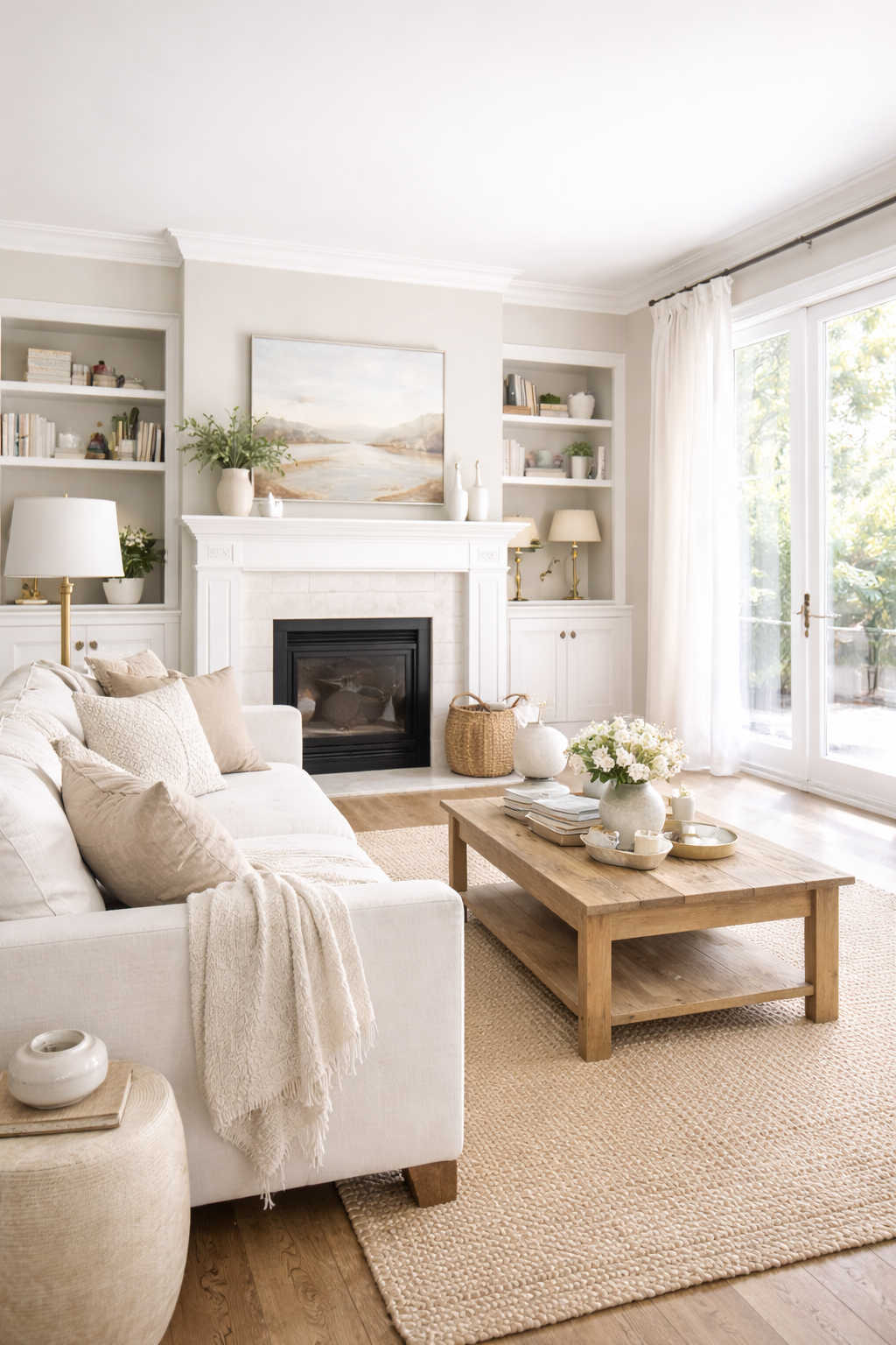
Agreeable Gray is one of the most popular warm greige paint colors ever made, and for good reason. It sits right at the greige sweet spot: warm enough to feel cozy, gray enough to feel sophisticated. It works in every room and reads beautifully in both natural and artificial light.
The reason this greige paint color stays relevant is its versatility. It plays with cool whites, warm creams, oak, walnut, black accents, and brass hardware. It doesn’t force you to redecorate around it. Your existing furniture simply looks better against it.
This is one of the best greige paint ideas for an open-plan home. When one neutral travels from the living room through the kitchen to the hallway, it needs to perform in every light condition. Agreeable Gray does exactly that.
(This is also the paint color that gets credited for selling homes. Coincidence? Probably not.)
The room feels serene and intentional, the kind of backdrop that makes every piece of furniture look like it was chosen carefully.
Shop the Look
3. Pale Oak by Benjamin Moore
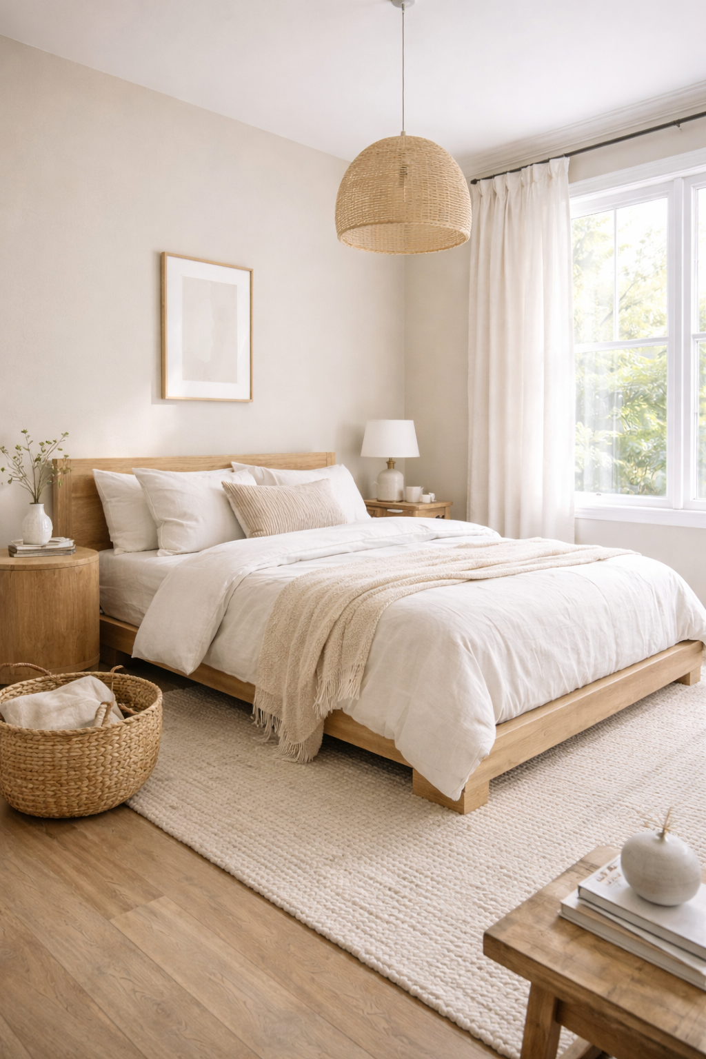
Pale Oak is the warm greige for people who want neutral without beige. It reads as an incredibly soft, almost blush-toned greige in bright rooms and a warm putty in rooms with less light. It’s delicate without being indecisive.
This is one of the top greige paint ideas for bedrooms because it creates an atmosphere that genuinely feels restful. The slight warmth in the undertone makes it feel more human than a cool gray while avoiding the heaviness some deeper greige tones carry.
Pale Oak works especially well with natural wood, linen, and rattan. It’s a great fit for Japandi aesthetics, organic modern design, and quiet luxury spaces where the focus is on texture and material rather than color.
One honest note: Pale Oak can look almost white in very bright, south-facing rooms. If you want it to read as a true greige, it needs a little shadow to show its depth.
Every room painted in Pale Oak feels like a place where someone thought carefully about how they wanted to feel inside it.
Shop the Look
4. Edgecomb Gray by Benjamin Moore
Edgecomb Gray is the warm greige that reads as sophisticated in traditional spaces and fresh in modern ones. It’s slightly deeper than Pale Oak with more visible gray in its tone, but it never loses the warmth that makes greige livable.
This is one of the best warm neutral wall colors for dining rooms and formal living spaces. It has enough presence to feel intentional in larger rooms but enough restraint to let furniture and art be the stars. It’s the paint equivalent of a very well-dressed person who doesn’t need to be the loudest one in the room.
Hot tip: Edgecomb Gray paired with Benjamin Moore White Dove on the trim is one of the most used combinations in high-end interior design. It’s accessible, versatile, and perennially relevant.
Watch for its tendency to shift slightly green in rooms with a lot of natural wood. If your floors and furniture are both honey oak, the green undertone in Edgecomb Gray can become noticeable.
The result is a room that feels quietly expensive, polished without trying too hard.
Shop the Look
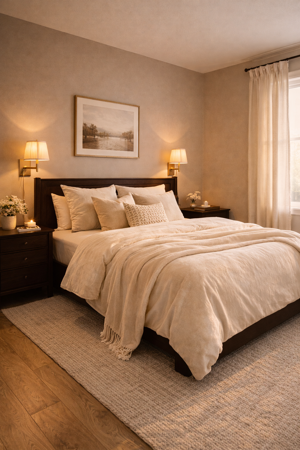
5. Revere Pewter by Benjamin Moore
Revere Pewter is the deeper, moodier end of warm greige paint ideas. It has a distinct gray presence that makes rooms feel grounded and rich, while its warm undertone keeps it from going cold or industrial. In good light it’s greige. In lower light it’s almost a warm charcoal.
This is one of the best greige paint colors for kitchens and bathrooms where you want a little drama without going fully dark. On lower walls with white uppers or in a powder room with white fixtures, Revere Pewter creates a contrast that feels deliberate and refined.
It’s also one of the most forgiving whole-home neutral paints for older homes where light levels vary dramatically from room to room. Its depth gives it something to say in both bright and dim spaces.
One honest caveat: Revere Pewter has become so widely used that some designers now steer clients away from it simply to be different. Its popularity is a feature, not a flaw.
Rooms in Revere Pewter feel settled and substantial, the kind of space that photographs beautifully and also genuinely feels good to be inside.
Shop the Look
6. Anew Gray by Sherwin-Williams
Anew Gray sits in the middle of the warm greige spectrum, not as light as Pale Oak, not as deep as Revere Pewter. It’s the room-temperature version of greige, comfortable and balanced, never demanding attention but always doing its job.
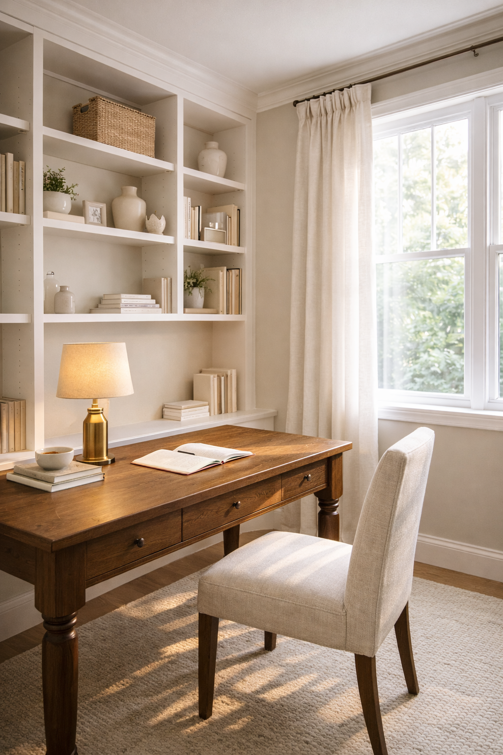
This is one of the most underrated warm greige paint ideas for home offices and studies. It creates a productive, calm atmosphere without the harshness of cool gray or the softness of cream. The warm undertone reduces eye strain in rooms with a lot of screen time.
Anew Gray also does something rare: it transitions well between spaces. A hallway, a living room, and a bedroom can all share Anew Gray and each feel distinct because the furniture and lighting do the differentiating work.
(It’s the kind of color you don’t notice when it’s there, but would immediately miss if it weren’t.)
Every room in Anew Gray feels pulled together in a way that’s hard to put your finger on. It works.
Shop the Look
7. Kilim Beige by Sherwin-Williams
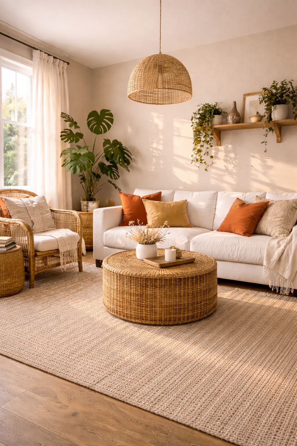
Kilim Beige leans more beige than gray, making it the warmest option on this list of warm greige paint ideas. It reads as a sun-soaked, earthy neutral that pairs beautifully with terracotta, warm wood, woven textures, and anything with an organic, handcrafted quality.
This is the greige for homes with a boho, global, or earthy aesthetic. Where other greige tones work by staying neutral, Kilim Beige works by leaning into warmth. It doesn’t try to be gray. It embraces its beige heritage while staying sophisticated enough to avoid the dated look of pure beige.
Hot tip: Kilim Beige and terracotta together create a palette that feels both timeless and current. Add a few plants and some woven textures and you have an interior that looks professionally designed without any design help.
In very bright rooms or rooms with a lot of white furnishings, Kilim Beige can feel heavy. Balance it with plenty of white or cream to keep the room feeling light.
The room ends up feeling warm and lived-in from the first day, the kind of space that always feels inhabited and welcoming.
Shop the Look
8. Perfect Greige by Sherwin-Williams
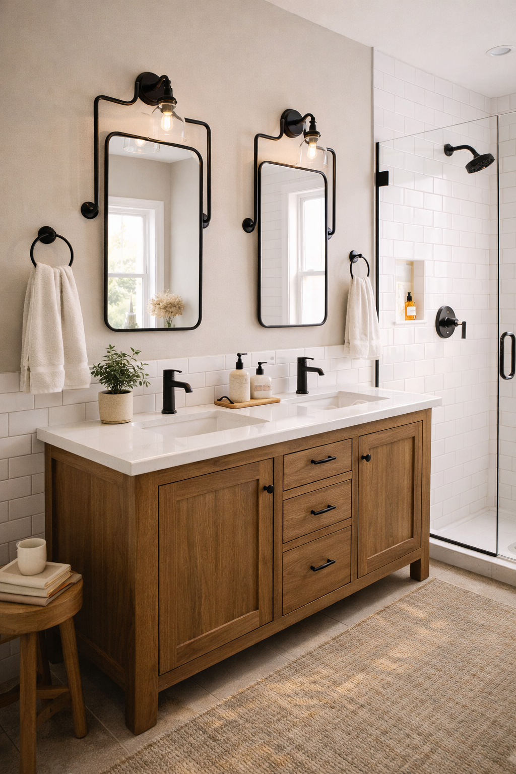
The name does a lot of work here, and Perfect Greige actually earns it. This warm neutral wall color sits exactly at the midpoint between beige and gray, genuinely balanced, neither tone dominating the other. It’s one of the cleanest greige paint colors on the market.
Perfect Greige is one of the best warm greige paint ideas for bathrooms because it works with white tile, warm wood vanities, and both warm and cool metal fixtures. In a space where materials are fixed, having a paint color this accommodating is a significant advantage.
It also reads well in rooms without natural light because its balance keeps it from skewing in either the warm or cool direction under artificial light. What you see on the chip is reliably close to what you get on the wall.
One thing to know: because it’s so balanced, Perfect Greige can read as a little flat in rooms that need personality. Use interesting lighting and layered textures to give it some life.
Rooms in Perfect Greige feel considered and clean, like everything in them was chosen with purpose.
Shop the Look
9. Balanced Beige by Sherwin-Williams
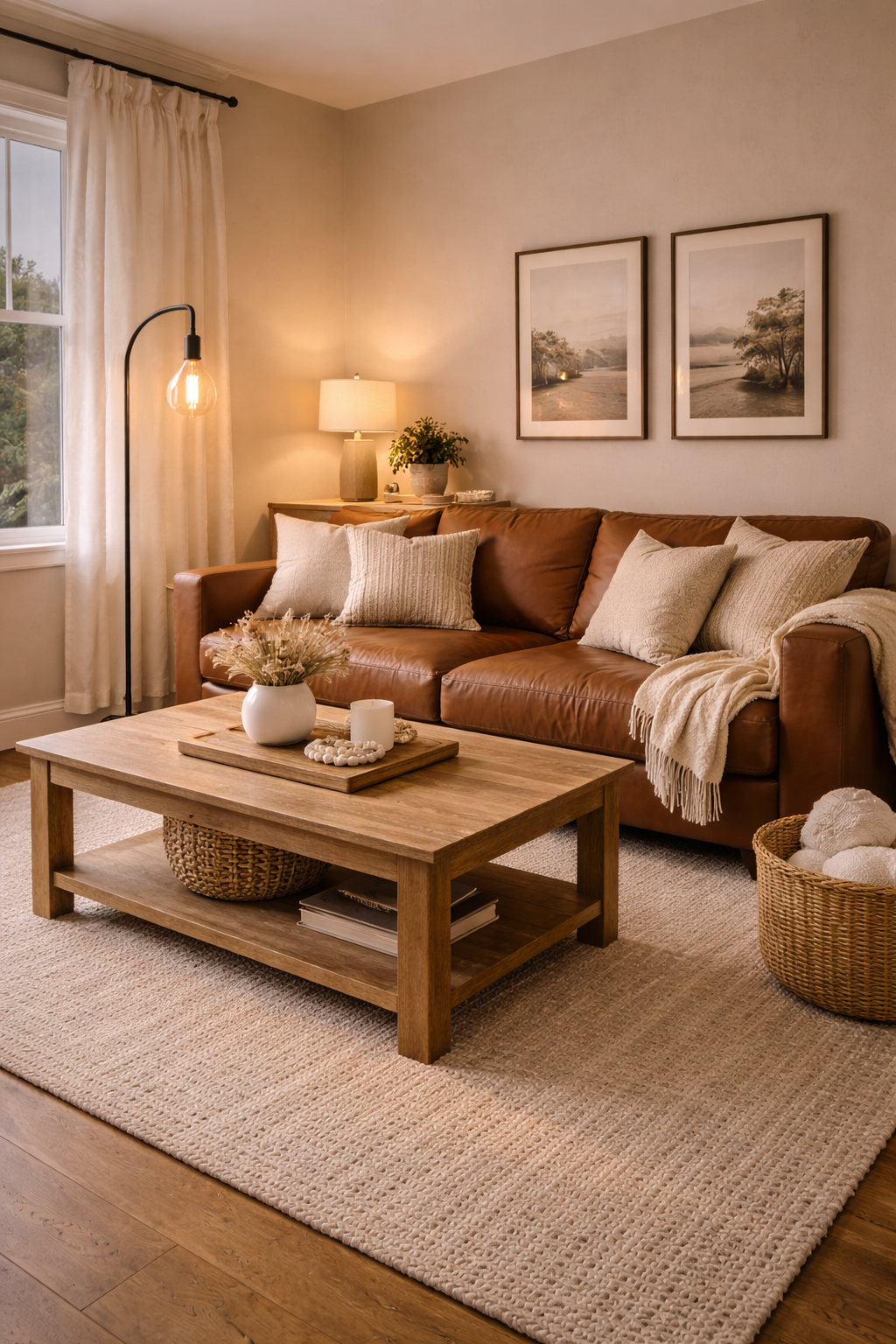
Balanced Beige is the warm greige paint color for rooms where you want to feel embraced rather than elevated. It’s slightly deeper and warmer than Agreeable Gray, with a richness that makes spaces feel cozy rather than airy. This is the greige for family rooms, dens, and living spaces where comfort takes priority.
The warmth in Balanced Beige makes it one of the best greige paint ideas for rooms with leather furniture, warm wood floors, and rich textiles. It doesn’t wash out brown tones the way cooler grays do. Everything in a warm, earthy palette looks better against it.
This is also a strong choice for rooms with lower ceilings. Warm colors recede less than cool ones, but they do make a space feel more intimate, which can be exactly what a low-ceilinged room needs to feel intentional rather than cramped.
(If your living room currently feels like it belongs in an office building, Balanced Beige is the antidote.)
The room ends up feeling like a place you actually want to be, warm, full, and completely at ease.
Shop the Look
10. Collingwood by Benjamin Moore
Collingwood is the cool side of warm greige paint ideas, a sophisticated neutral that reads more gray than beige but holds just enough warmth to stay out of cold territory. It’s one of the most versatile greige paint colors for homes with cool-toned elements like marble, navy, or chrome.
Where warmer greiges like Kilim Beige or Balanced Beige work with earthy tones, Collingwood bridges the gap between warm and cool. It can sit alongside a navy sofa, a cool-gray rug, and warm wood floors and still feel cohesive. It’s the translator between different design languages in an open-plan home.
This is also one of the best whole-home neutral paints for newer builds with cool-toned finishes. Modern homes with quartz countertops, gray tile, and chrome fixtures often read cold. Collingwood adds warmth without conflicting with those cool elements.
In rooms with very warm lighting (incandescent or warm LED bulbs), Collingwood can shift to read more beige than expected. Cool-toned bulbs keep it in the greige range.
Rooms in Collingwood feel polished and current, the kind of calm that looks effortless but was clearly well-considered.
Shop the Look
11. Cappuccino by Benjamin Moore
Cappuccino is the deepest warm greige on this list and the most dramatic. It’s rich, enveloping, and deeply warm, sitting closer to a dark taupe than a standard greige. In rooms with good light it reads as a sophisticated greige. In low light it becomes an almost cocoa-toned accent.
This is one of the best warm greige paint ideas for master bedrooms and moody dining rooms where you want the color to do real design work. Cappuccino creates an immediate feeling of enclosure and luxury that lighter greiges can’t match.
Hot tip: when going this deep with a warm greige paint color, the ceiling color matters more than usual. A crisp white ceiling lifts the whole room. A greige or cream ceiling pulls it down further, which can feel stunning or suffocating depending on the room height.
Balance this deep tone with plenty of light-colored textiles. Cream, ivory, and soft white in the bedding and curtains prevent the room from reading too dark during the day.
The room feels like an exhale, deeply comfortable and deliberately luxurious.
Shop the Look
12. Alpaca by Sherwin-Williams
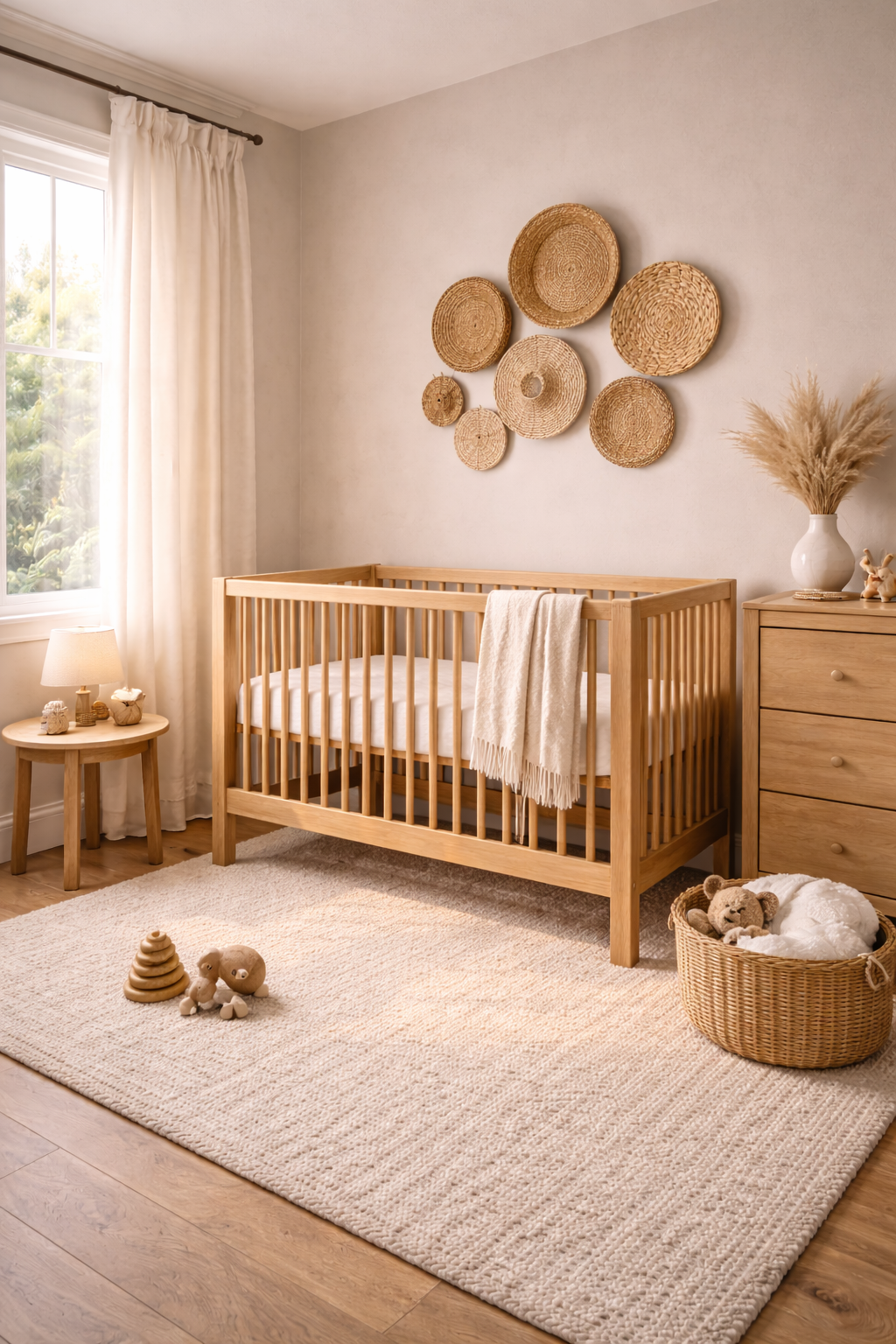
Alpaca is the most modern feeling warm greige paint color on this list. It reads as a very light, slightly warm putty, sitting at the edge of greige and off-white. It’s sophisticated, clean, and has a quiet presence that makes rooms feel deliberately minimal without ever feeling cold or sterile.
This is one of the best warm greige paint ideas for nurseries, small rooms, and spaces where you want warmth without committing to a heavy color. It makes small rooms feel larger because it reflects more light than deeper greiges while still reading as intentionally colored rather than default builder-white.
Alpaca works beautifully with organic modern design, woven textures, natural wood, and anything with a handmade quality. It’s the backdrop that makes artisan objects look more considered.
One caveat: it can read almost white in rooms with a lot of natural light. Pair it with off-white trim rather than bright white to give it room to read as its own color.
The room ends up feeling like a considered, breathing space, warm and calm in a way that stays fresh no matter the season.
Shop the Look
Test Before You Commit
Every warm greige paint color on this list will look different in your specific light, with your specific floors and furniture. The one rule that applies to all of them: buy the sample, paint a large swatch, and live with it for 48 hours before ordering gallons.
Look at it in morning light, afternoon light, and under your lamps at night. The right one will look better in every condition. The wrong one will bother you at least once a day.
When you find the right warm greige for your room, the whole space settles. Everything you already own looks better. That’s how you know you got it right.
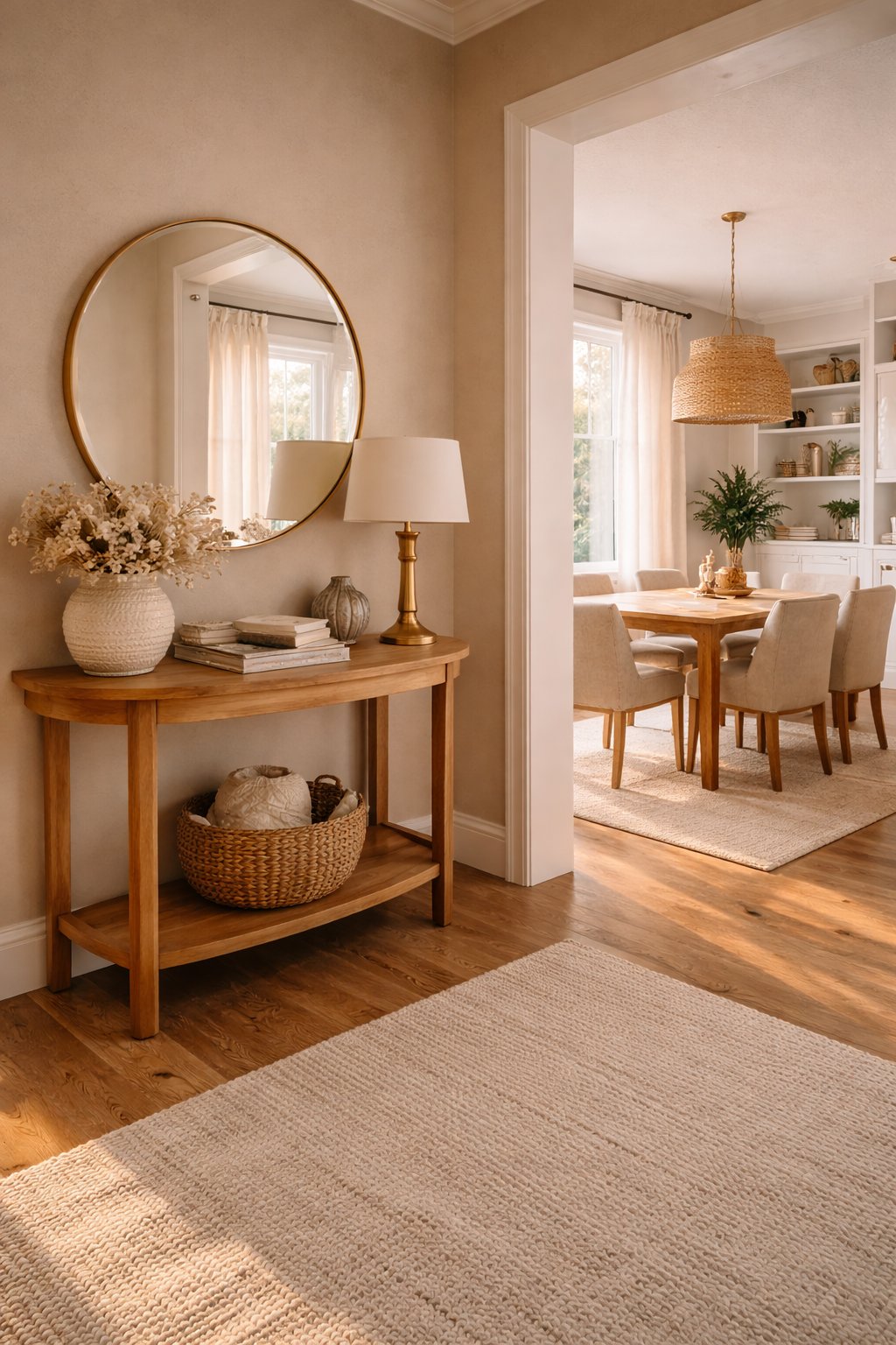
Want more help building a whole-home palette? Read 12 Color Schemes for the Home That Flow for ideas on how to carry one neutral through every room.