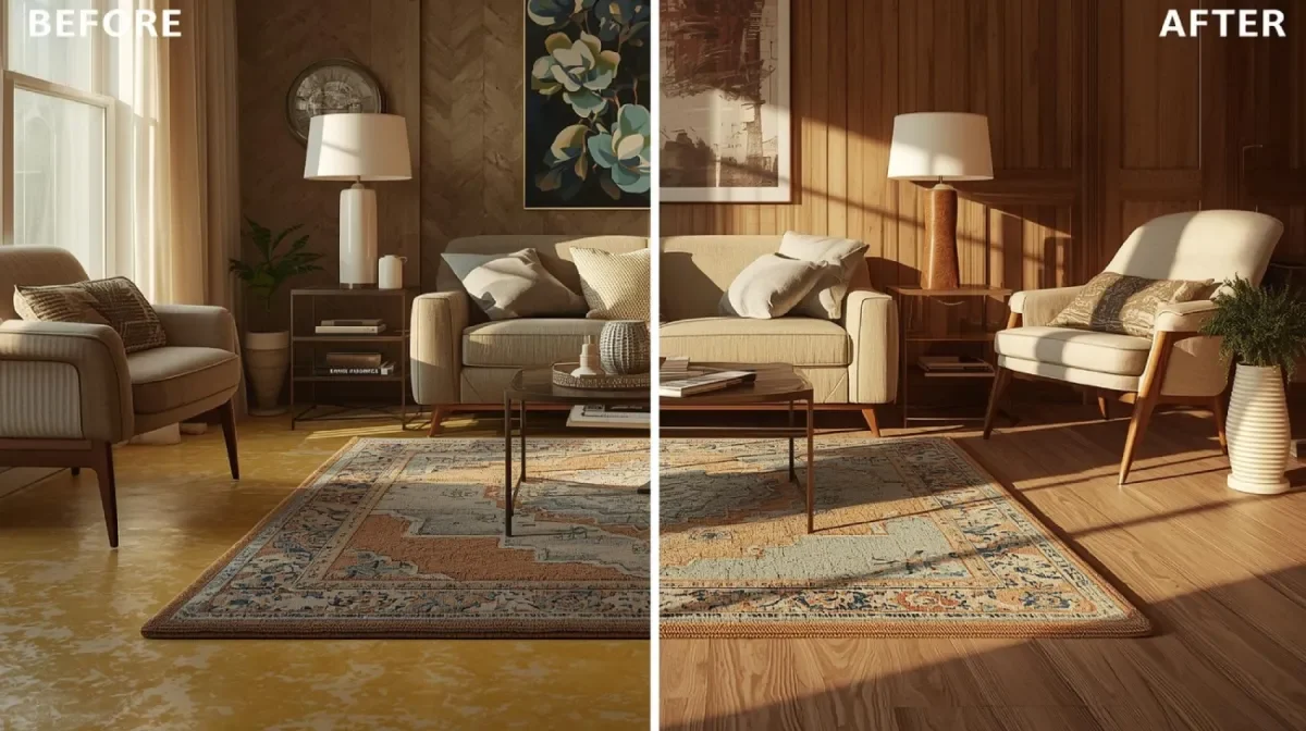
You’ve probably seen it on Pinterest or scrolling Instagram: a living room where the walls and ceiling are drenched in the same moody green or cozy beige, no bright white in sight. This trend — officially called color drenching — is one of the biggest shifts in interior design right now. And it’s not just a style flex. It’s strategic.
Designers love it. DIYers are doing it. Paint companies are pushing it hard. But let’s not pretend every trend works in every space — or for every budget.
Painting your ceiling the same color as your walls can make a room feel cohesive, modern, and high-end. It can also make it feel flat, claustrophobic, or like a bad Pinterest fail you now have to repaint. So before you go monochromatic, let’s break down the real pros, the actual cons, and whether this bold move is worth it for your home.
What Is Color Drenching and Why Is Everyone Doing It?
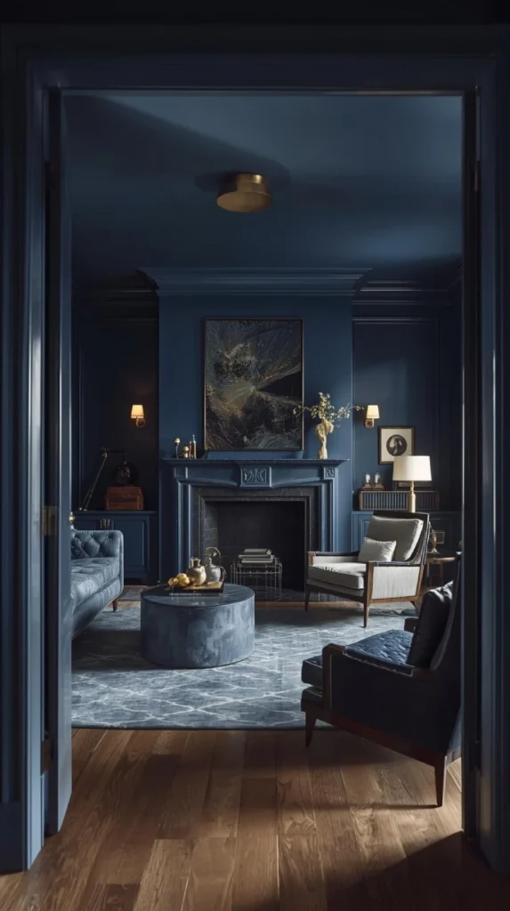
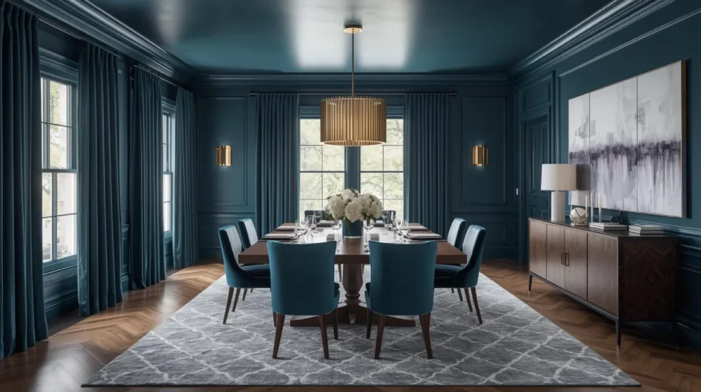
Color drenching means covering your walls, ceiling, trim — sometimes even doors — in the same color. It creates a seamless, immersive look that feels bold but pulled together.
It’s everywhere right now because:
- It feels intentional and styled, even in small spaces
- It works with almost any color (muted neutrals or rich jewel tones)
- It makes paint decisions faster and easier
- It photographs incredibly well — and let’s be honest, that matters now
But that doesn’t mean it’s right for every room or every person.
The Pros of Painting Your Ceiling the Same Color
Let’s start with what works in your favor:
1. Creates a Cohesive Look
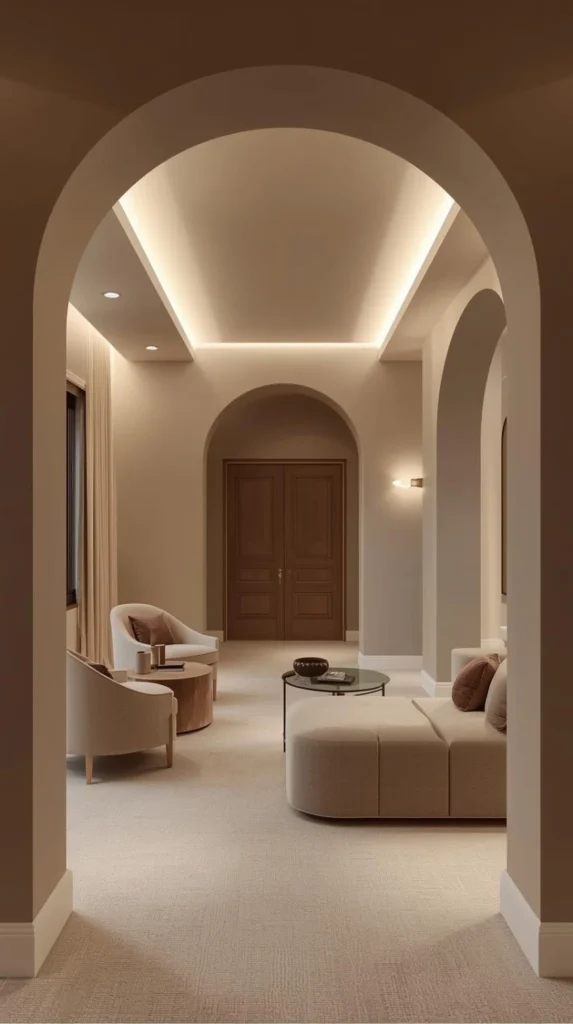
No visual breaks = more flow. When the ceiling isn’t a stark white contrast, your eye isn’t jumping around the room. It’s smooth, continuous, and sophisticated.
2. Makes Low Ceilings Disappear
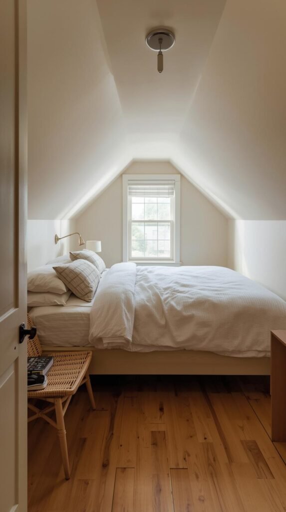
If your room has a standard or low ceiling, painting it the same color as the walls can blur the line and make it feel taller — especially with a matte finish.
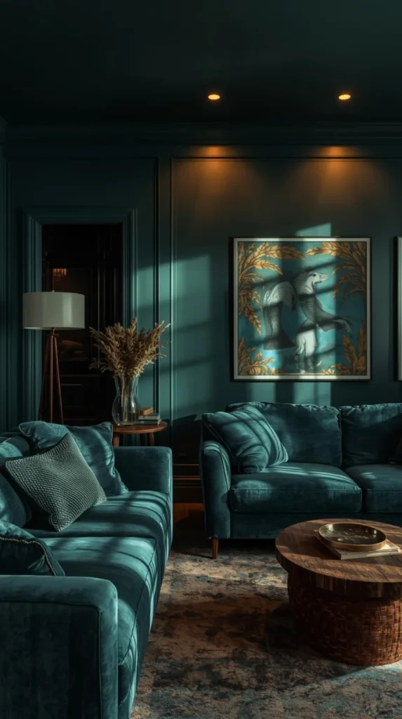
3. Feels Cozy and Intentional

Monochromatic rooms feel like a hug. Whether it’s a deep navy or a soft greige, color drenching adds warmth and intimacy — ideal for bedrooms, offices, or dens.
4. Saves Money and Time

No need to buy multiple paint colors. No taping off. No awkward cutting in. It’s easier and cheaper — around 20–30% savings in paint and labor if you’re hiring someone.
5. Modern, Trend-Forward Style

If you want your space to feel updated and editorial, this look hits. It leans minimalist without being boring, and luxe without screaming “trying too hard.”
The Cons You Need to Seriously Consider
This trend has teeth. Here’s what could bite back:
1. Can Make Small Rooms Feel Smaller
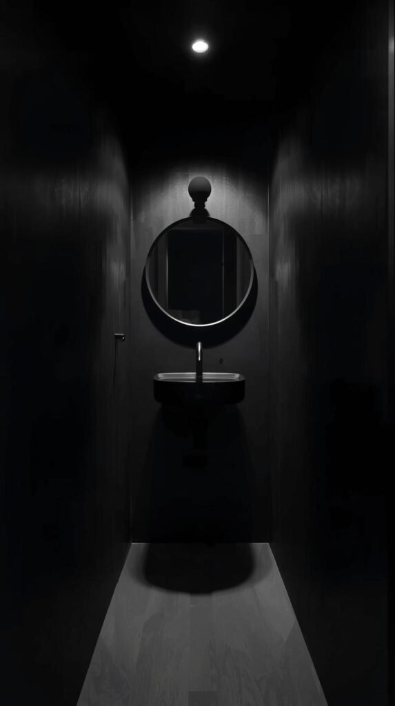
Yes, color can expand or shrink space depending on depth and light. In already cramped rooms, a full drench in the wrong color can feel like the walls are closing in.
2. Kills Contrast (and Architectural Features)

Got crown molding? Unique ceiling details? They’ll get lost unless you play with sheen or choose a slightly different tone. Flat color across everything can look like primer if you’re not careful.
3. Limits Future Flexibility
Switching one wall color later means repainting the ceiling, too. And touch-ups? Not easy. Monochromatic rooms show wear fast — and uneven paint jobs even faster.
4. Lighting Becomes More Critical
Drenched rooms can absorb light unevenly, especially if the color is dark. You might need more light sources or layered lighting to prevent it from feeling dull.
When It Works Best (and Where It Doesn’t)
Color drenching isn’t one-size-fits-all. Here’s where it shines — and where it flops.
Best Rooms for Same-Color Walls and Ceilings:
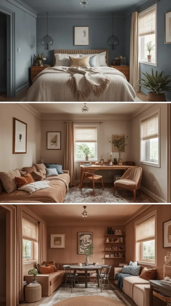
- Bedrooms – Create a cozy, retreat-like vibe
- Dining Rooms – Make it feel intentional and upscale
- Small Offices or Nooks – Boosts mood and energy with the right color
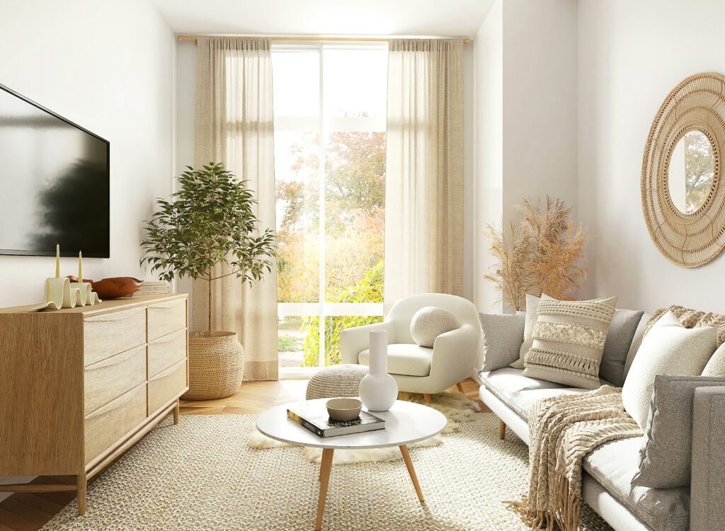
Riskier Rooms:
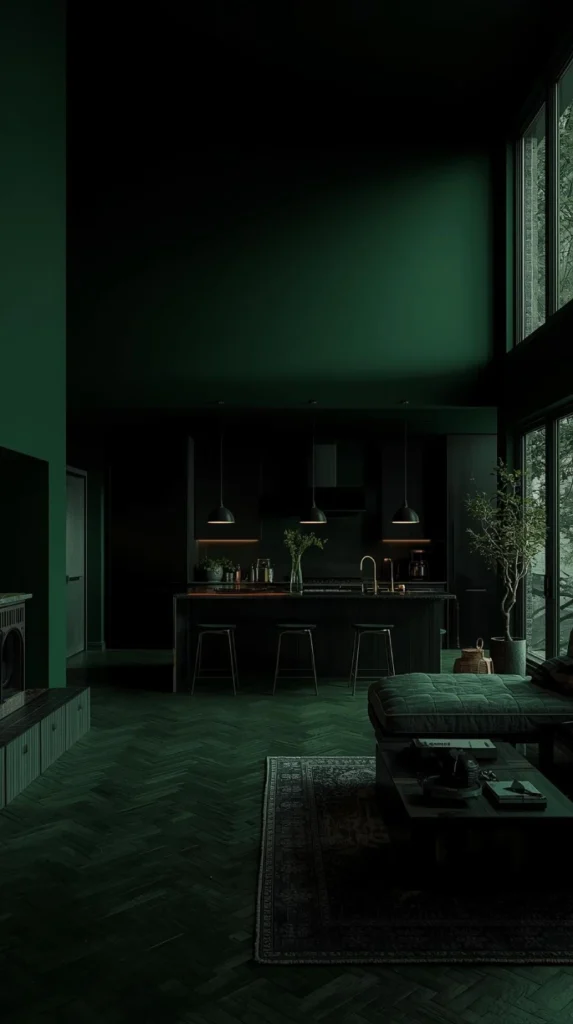
- Open Living Areas – Can feel boxy or “too much” in large daylight-filled rooms
- Kitchens – Ceilings need to reflect light for function
- Low Natural Light Spaces – Drenching in darker colors might make it feel like a cave
Ceiling Paint vs. Wall Paint: Don’t Get It Twisted

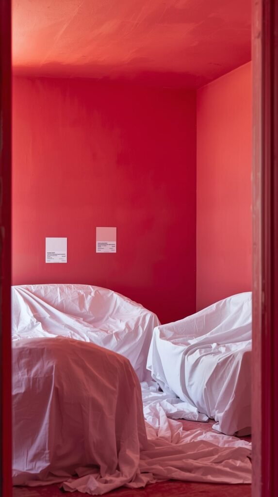
Same color doesn’t mean same product. Ceiling paint is made thicker, with a flat finish that hides imperfections and drips less. Wall paint has more sheen and a thinner formula. If you’re matching colors, you’ll need to either:
- Use the same brand and finish across both (only if the finish works on ceilings)
- Use two formulas with the same color code (e.g. wall paint in eggshell, ceiling paint in flat)
Using the wrong combo? You’ll notice — especially under lighting.
Tips to Nail the Look Without Regret

If you’re going in on this trend, go all in — but do it smart.
Do:
- Paint ceiling first, then walls
- Use matte on the ceiling, satin or eggshell on walls
- Stick to neutral, muted tones for safety (or go full jewel-tone drama if that’s your vibe)
Don’t:
- Wing it with color matching across brands
- Use high-gloss anything — unless you want a reflective ceiling
- Forget to test lighting at multiple times of day
Best Paint Brands for Matching Walls and Ceilings
Here’s a cheat sheet of tried-and-true brands that offer solid performance across both surfaces:
| Brand | Wall Paint | Ceiling Paint | Why It Works |
|---|---|---|---|
| Benjamin Moore | Regal Select | Waterborne Ceiling Paint | Rich colors, premium finish, easy to match |
| Sherwin Williams | Emerald / Duration | Eminence / ProMar Ceiling | Professional-grade formulas, consistent tones |
| Farrow & Ball | Estate Emulsion | Modern Emulsion (can use on ceiling) | Boutique style, eco-friendly, dramatic tones |
| Clare Paint | Interior Wall Paint | Wall & Ceiling Bundle | Curated modern colors, designed for monochrome |
| ECOS Paints | Zero-VOC Interior | Wall & Ceiling Collection | Non-toxic, sustainable, matte-friendly |
| Behr | Ultra Paint & Primer | Ceiling Flat Interior | Budget-friendly, one-coat options |
Tip: Always check the Light Reflectance Value (LRV) if you’re going monochrome. Higher LRV = reflects more light.
What Designers Say vs. What DIYers Regret

Designers love:
- The seamless vibe
- Calm, unified spaces
- The modern-meets-moody aesthetic
DIYers warn:
- It’s not as easy as it looks
- Prep and lighting matter more than usual
- Once you commit, it’s hard (and expensive) to undo
This isn’t a casual refresh. It’s a full-room transformation. And like most things in design, success is 80% planning, 20% paint.
Should You Do It?
Here’s the deal: painting your ceiling the same color as your walls can make your space feel intentional, elevated, and expensive — if done right. But it can also box you in visually and financially if you aren’t strategic.
Ask yourself:
- Do you want cozy or airy?
- Are you okay committing to one look for the long haul?
- Will you hate it in six months?
If you’re working with a small bedroom, office, or dining room and want a modern, curated look — this is a move worth making. But if you’re indecisive, trend-hopping, or decorating big open spaces… maybe skip the ceiling and stick to just the walls. Drop your room situation in the comments — I’ll tell you straight if it’s a yes or a hard pass.
Explore How to Add Art Deco Glamour Without Going Overboard — packed with bold color ideas, luxe finishes, and statement pieces that instantly elevate your space without committing to a full paint overhaul.
Mini FAQ: Painting Ceiling the Same Color as Walls
Q: Does painting the ceiling the same color make a room look bigger or smaller?
A: It depends. In smaller rooms, matching walls and ceiling can blur boundaries and feel bigger. But in low-light or already tight spaces, it can make the room feel closed in.
Q: Can I use the exact same paint for both ceiling and walls?
A: Technically yes, but it’s not ideal. Wall paint is thinner and usually has more sheen. Ceiling paint is thicker, matte, and hides imperfections better. Match colors, but use the right formula for each surface.
Q: What rooms are best for color drenching?
A: Bedrooms, dining rooms, powder rooms, and offices are perfect. Avoid large open-concept living spaces or rooms that rely heavily on reflected light (like kitchens).
Q: Is it cheaper to use one color for walls and ceiling?
A: Yes. You’ll save 20–30% on paint and labor since there’s less taping, less waste, and fewer tools involved.
Q: What are the downsides to watch out for?
A: Loss of architectural contrast, lighting issues, and tricky maintenance. Once everything is the same color, any flaws or touch-ups stand out more.