Choosing the right paint colors isn’t just about picking a shade you like. The colors you put on your walls have the power to shift the entire atmosphere of a space. They can make a small room feel larger, a cold room feel warmer, or a plain room feel layered and intentional. The right pairing can highlight architectural details, bring balance to the furniture you already own, and instantly update your home without a full renovation.
What makes color combinations so effective is contrast and balance. A deep shade paired with a light neutral adds structure and sophistication. Soft tones layered together create harmony and calm. Bold complementary colors inject energy and personality into the room. And when you get it right, the whole space feels more cohesive—like every piece belongs together.
In this guide, you’ll find 11 paint color combos that aren’t just trending but timeless. Each one is versatile enough to work in multiple rooms but impactful enough to stand out. Whether you’re drawn to rich jewel tones, muted naturals, or high-contrast pairings, these combinations will help you take your walls from background to statement.
Navy Blue and Crisp White

Navy and white is clean, confident, and never out of style. It adds contrast and depth without making the room feel dark or heavy. In the kitchen shown here, matte navy cabinets ground the space, while glossy white countertops and backsplash keep it fresh and sharp. The lines are simple. The palette is tight. The impact is strong.
Navy gives you a rich backdrop to layer in texture, metal finishes, or bold accessories. White opens things up and reflects the light, especially in spaces where you need brightness. Together, they create a high-contrast look that reads modern but still classic. And when you throw in an unexpected accent—like the orange pot in this shot—it adds just enough tension to keep the design interesting.
This combo works in kitchens, bedrooms, or even exterior trim. It’s a go-to palette for a reason.
Light Lavender and Cream
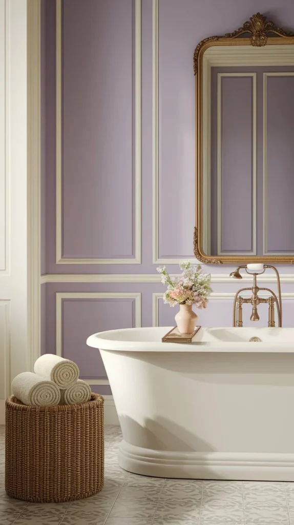
Lavender is soft without feeling washed out. Cream warms it up without adding yellow. Together, they create a light, tonal palette that feels effortless. In this bathroom, pale lavender walls give the space some color while still feeling clean. Cream trim, fixtures, and accessories blend in instead of standing out, which makes the room feel more cohesive.
The pairing works because neither color tries to overpower the other. It’s subtle. Balanced. If you want to keep things feeling fresh, bring in natural materials like wood, stone, or woven textures. That layered softness adds interest without taking away from the color story.
This combo works especially well in smaller spaces like bathrooms or guest bedrooms where you want softness, not saturation.
Teal and Warm Wood Tones
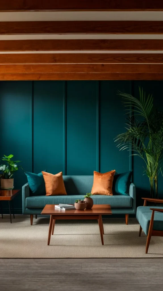
Teal adds depth. Wood brings warmth. Together, they create a space that feels grounded but rich. In this living room, the teal walls anchor the room without overwhelming it. The exposed beams and coffee table echo that natural tone, creating a clear connection between the wall color and the finishes.
What makes this work is balance. The sofa and textiles soften the bold color. You’ve got navy, mustard, and cream layered into the pillows without pulling focus. The round coffee table keeps things approachable, and the circular shape helps break up all the strong lines in the space.
This combo doesn’t try too hard. It’s cozy, but not cluttered. And it’s versatile enough to use in living rooms, offices, or any space where you want a little more contrast without going all in on dark.
Soft Gray and Warm Beige

Gray and beige are often labeled as safe, but when done right, they’re anything but boring. In this living space, soft gray walls give the room a light, clean backdrop. Beige seating and accents warm it up, making the space feel relaxed but finished.
This works because both colors stay within a similar value range. No high contrast. No visual noise. Just subtle shifts in tone and texture that make the space feel cohesive. The wood flooring and coffee table bring in a natural material that ties both colors together and gives the palette some movement.
If you want a neutral space that feels calm but not cold, this is the combo to try. It adapts to traditional or modern interiors without needing much extra styling.
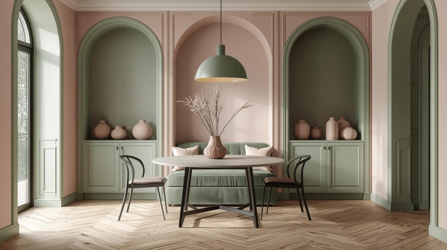
Muted Green and Earthy Terracotta
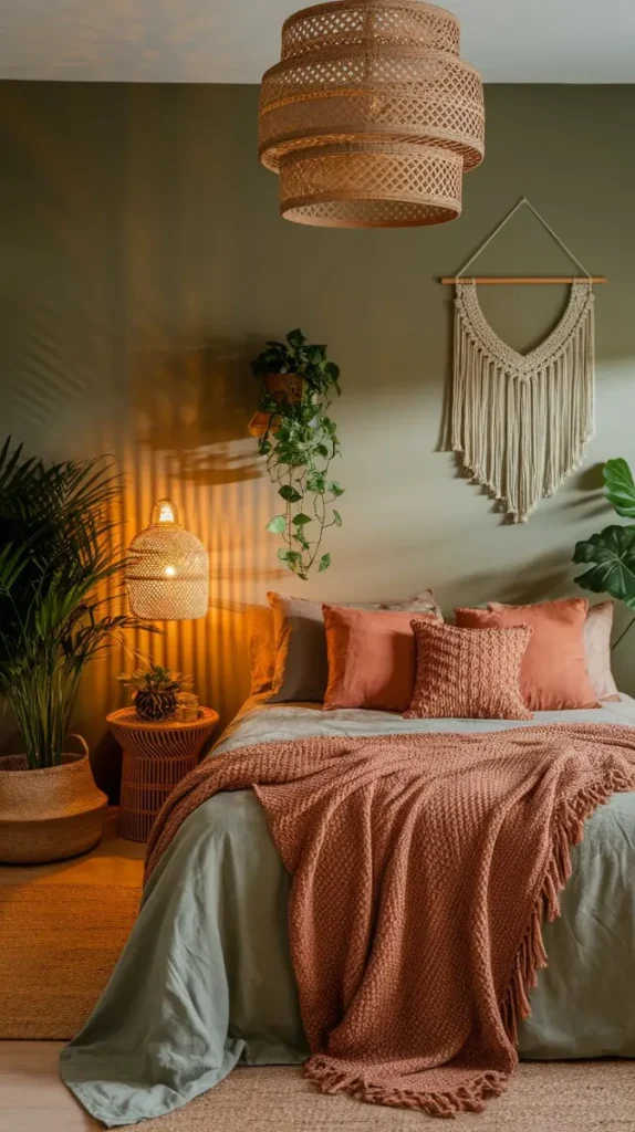
This combo leans natural but doesn’t feel rustic. Muted green on the walls sets a calming tone, and terracotta accents bring in just enough contrast to keep things visually interesting. In this bedroom, the mix feels intentional. You’ve got softness, but you’ve also got structure.
The key here is restraint. The terracotta shows up in textiles and accessories, not all over the room. That keeps it from feeling too heavy or seasonal. The green wall color holds the room together and gives it a grounding element, especially when paired with natural textures like linen, wood, or ceramics.
It’s a great palette if you want to bring in color but still keep the room feeling calm and uncluttered.
Charcoal Black and Bright Yellow
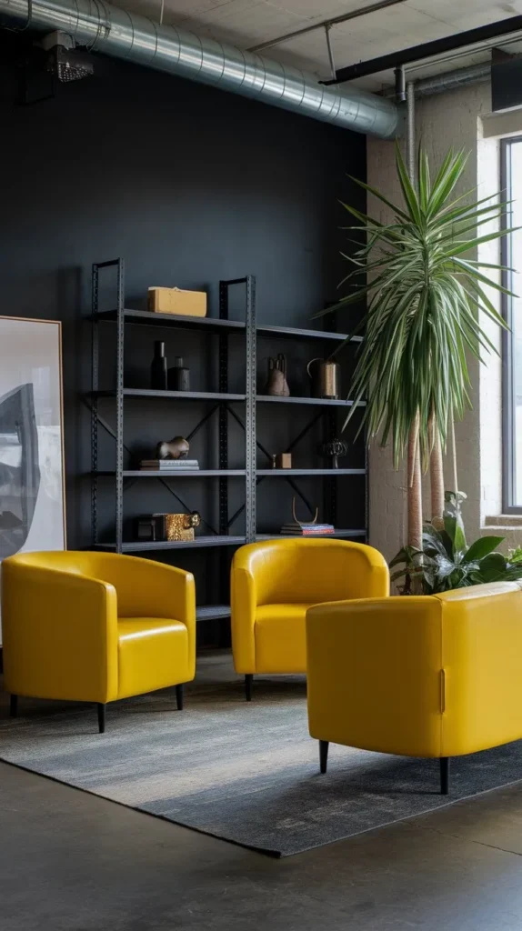
This pairing is bold, but when done right, it’s not overwhelming. Charcoal black sets the foundation. It adds structure and drama. Yellow comes in as the contrast, bringing energy and light to balance it out.
In this modern space, you see the formula clearly. The black wall keeps things moody and clean. The yellow seating adds a focal point without taking over. It’s the kind of pairing that makes a space feel intentional—like every element has a reason to be there.
To soften the look, layer in some green. Plants do more than just add color. They break up the contrast and give the palette a more organic feel. Use this combo in creative spaces, home offices, or anywhere you want to make a visual statement without going full maximalist.
Dusty Rose and Soft Taupe

This is a warm, tonal pairing that feels pulled together without looking too styled. Dusty rose adds a muted hit of color. Taupe balances it with a soft, earthy undertone. In this dining space, the rose walls create warmth without feeling overly feminine or trendy.
The key here is texture. You’ve got a natural wood table, curved seating, and subtle color shifts that create depth without contrast. The floral centerpiece ties the palette together but doesn’t compete. Even the floor tones complement the palette rather than fighting it.
This combo works because it feels lived-in. Nothing is trying too hard. It’s a smart choice for shared spaces like dining rooms or open-plan areas where you want mood without saturation.
Slate Blue and Burnt Orange
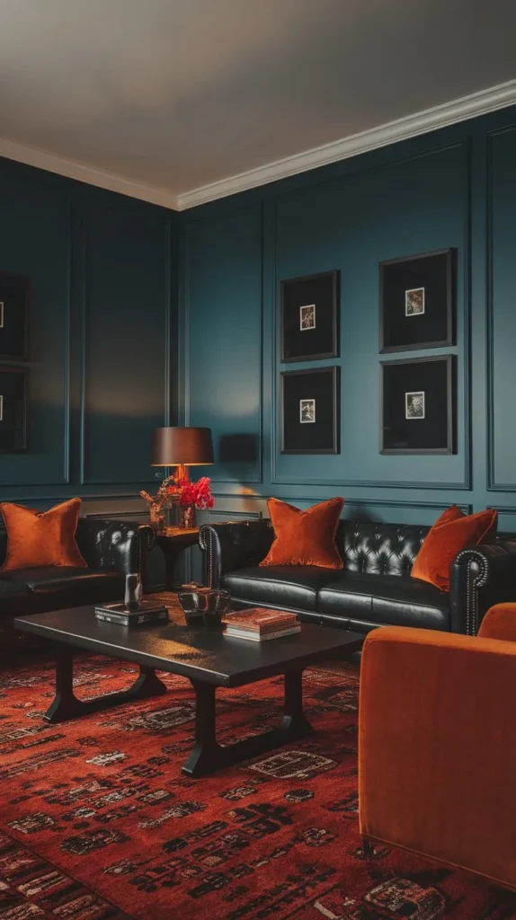
This one’s all about contrast. Slate blue is cool, steady, and grounded. Burnt orange brings in heat and boldness. In this living room, the combo feels rich without being overwhelming.
The blue walls do the heavy lifting, setting a calm base for the orange to play off of. You’ve got orange in pillows, lamps, and decor—just enough to pop. The black leather sofa adds structure, while the warm-toned rug pulls everything together and softens the transition between colors.
This combo is great when you want to create visual interest without bringing in busy patterns or loud elements. It’s especially effective in living rooms or family spaces where you want depth but still need it to feel relaxed..
Rich Plum and Gold Accents
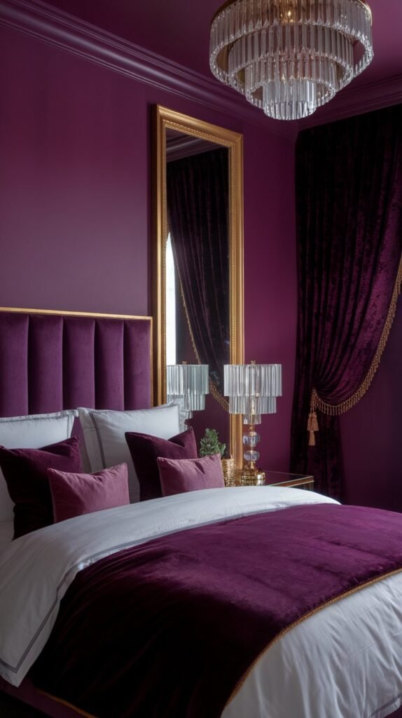
Plum and gold is a high-impact combo that reads luxe but not flashy. The deep plum walls in this bedroom instantly warm up the space, while gold hardware, lighting, and trim elevate the overall design.
It’s a classic case of contrast done right. The gold doesn’t fight with the plum—it enhances it. Soft white bedding balances out the darker tones and makes the room feel more open. Texture is key here. Quilted pillows, mixed materials, and reflective finishes help the space feel dynamic.
Use this combo in bedrooms or formal living spaces where you want to create mood. Just keep the layout simple so the color can speak for itself.
Warm Coral and Soft Gray
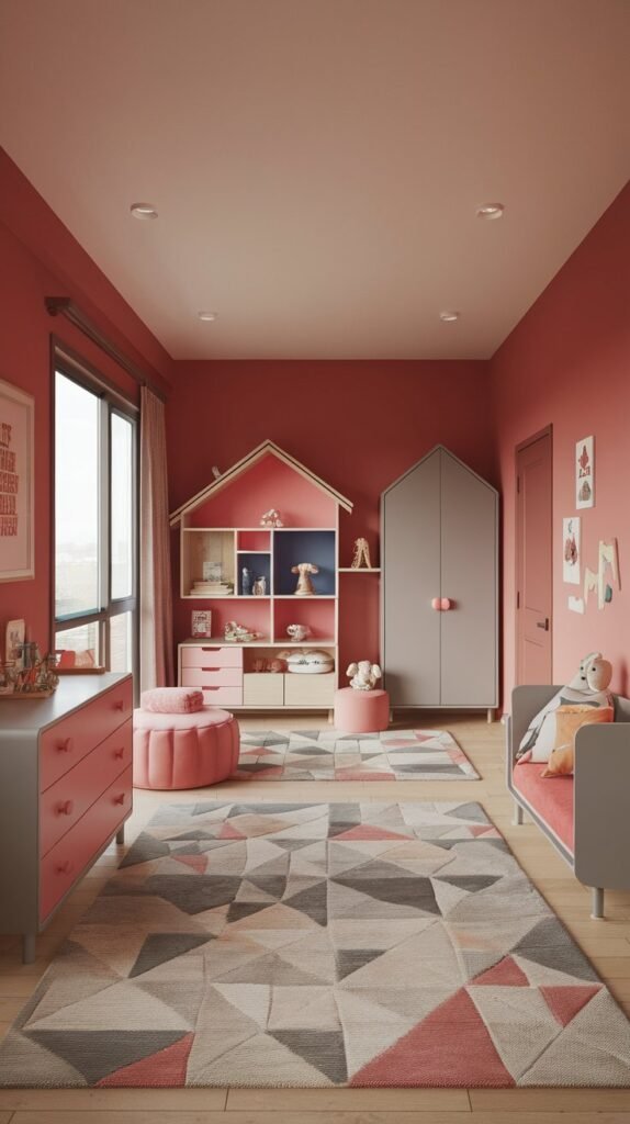
Coral is cheerful without being loud. Gray keeps it grounded. In this kid’s room, the combination feels vibrant and youthful but still polished.
The coral wall brings in color, but it’s not overpowering. Gray furniture and soft fabrics tone everything down and add structure. The key to this palette is restraint. Everything else—art, rug, furniture—is simple and textural, not busy or high-contrast.
This combo is perfect if you want a space that feels light, fun, and easy to evolve over time. You can keep the coral as a statement wall and rotate out accessories as the space or its function changes.
Olive Green and Natural Stone

Olive green brings in a natural, grounded feel. When paired with stone, it adds weight and texture without looking too rustic. In this entryway, olive walls set the tone and create instant atmosphere, while the stone detail adds visual depth and contrast.
The warm rug and wood door add softness and keep the space from feeling too hard or architectural. This combo is subtle but layered. It doesn’t rely on trendy color blocking or loud contrast—it works because it feels rooted in nature.
Paint is one of the easiest ways to completely shift the vibe of a space without renovating or spending a fortune. But picking the right color combo matters. These 11 pairings are about more than just aesthetics—they’re about creating flow, contrast, and personality in every corner of your home.
Now it’s your turn. Which color combo are you thinking about trying next? Let me know in the comments below—I’d love to hear what direction you’re leaning toward. And if you’re still figuring out how to pull it all together, don’t worry. You’ve got options.